
Axiom

ART DIRECTION - HEXWORKS DEV JOURNALS


The artistic vision
For me, it starts with an initial spark. When I started working on Lords of the Fallen we had the lore legacy of the original 2014 game, but we knew from the get go that we wanted a more grounded, dark, and mediaeval art style. We felt it worked better with the story we wanted to tell, as well as encapsulate the emotions we wanted to convey to our audience.
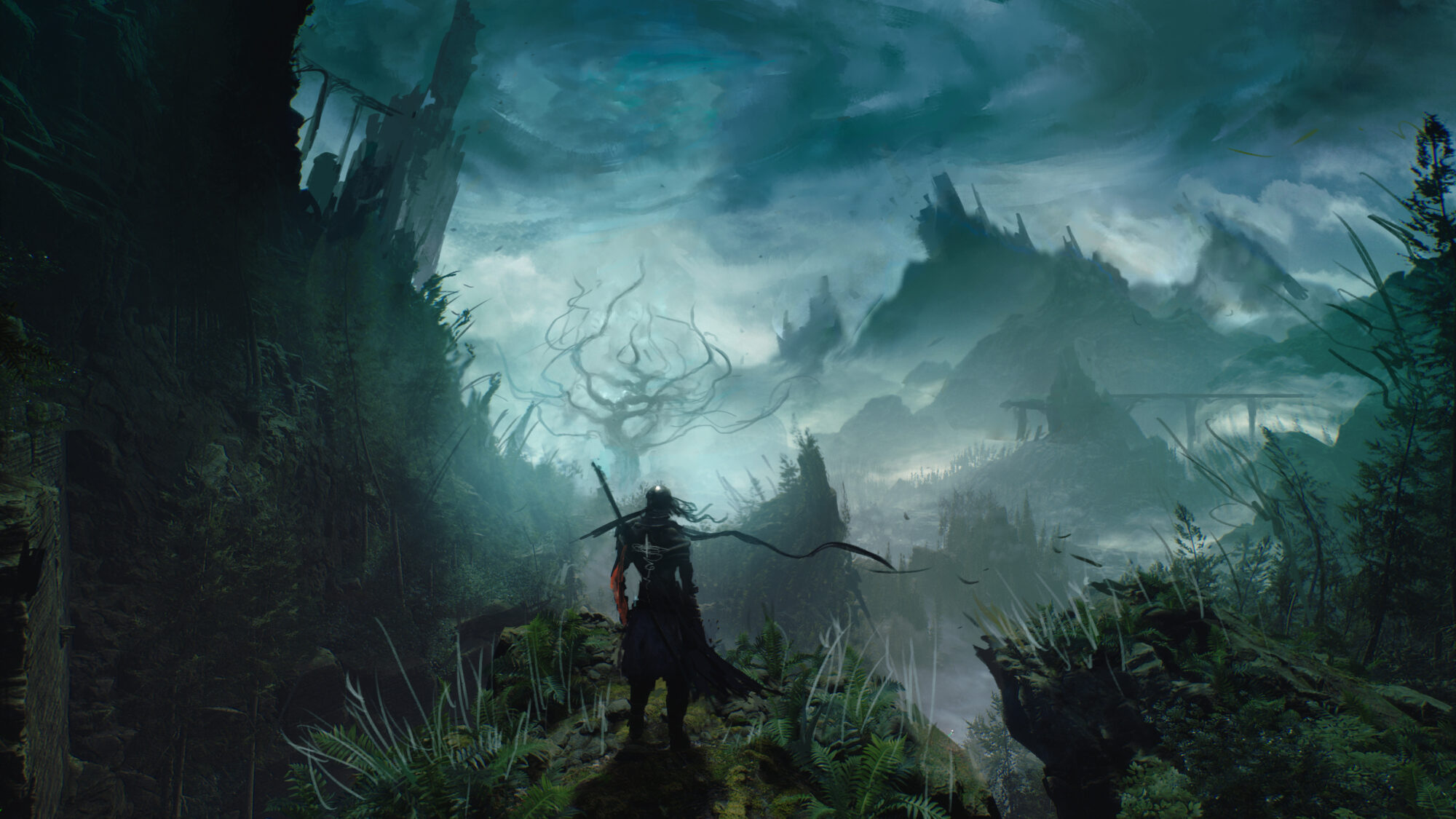
Originally, our game had a very realistic aesthetic, with knights and chivalry, castles and monasteries, but then we injected this spark of tormented fantasy from one of my very first concept arts for the game: a landscape with a stylized knight standing in front of a dark fantasy tree. This poor chevalier was contemplating the rest of the journey that awaited him, and from that image we realised we could open our world to a more allegorical style, with its moments of extravagances and magics.
On top of that, we explored the ideas for Umbral, the realm of the dead, which opened the gates to themes of cosmic horror and Lovecraftian creatures, and further solidified the tormented dark fantasy style we were looking for.
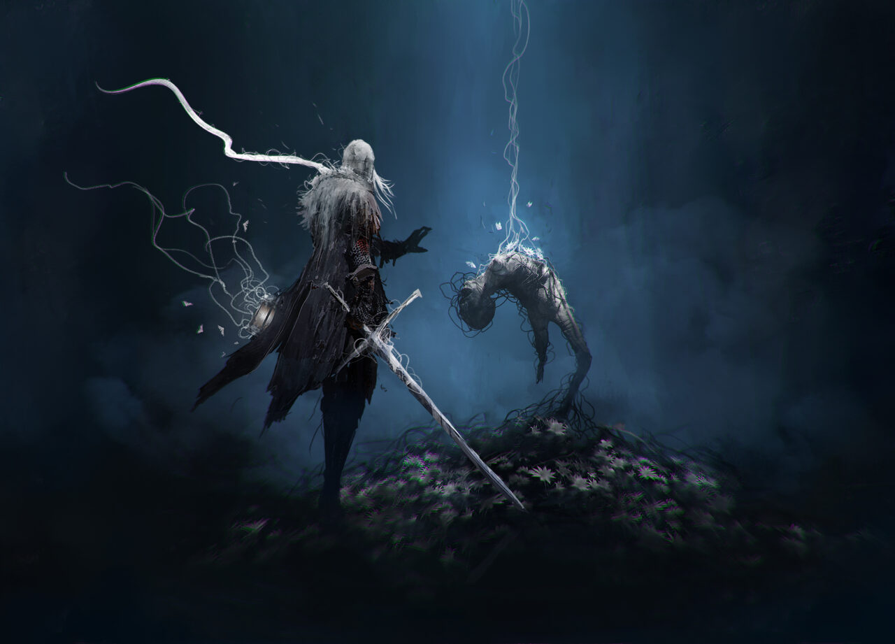
One exercise I like to do is ask myself what the game could/should become, and imagine a future screenshot. At first this image is very blurry in my mind, a bit undefined, full of personal references… but the more I develop it, the more the image becomes clearer and clearer, until the moment where I can say to my colleagues, “Wait, guys! I think I’ve got it!”
For Lords of the Fallen, my imagined screenshot was of a knight wearing heavily rusted armour and a skull-spiked helmet, carrying a sword wrapped in thorns, and walking down a candlelit corridor with walls covered in blood. Underneath his footsteps, white lilies and grey moths were growing out of the ground… Quite explicit, don’t you think?
This vision actually followed me during most of the preproduction! It even became an internal joke, that I was the guy adding skulls, blood and candles all over the place! But I guess when you have a vision, you have to stick to it, right?
Designing the world of Lords of the Fallen
I think the most important part for me when the design process started was to set a clear direction, something I would be comfortable to rely on and communicate to the artists and the rest of the development team.
For this purpose, my art direction rested on a number of high-level pillars, before refining those themes into systems and personal references. I am a strong believer of introspection and gathering strong thematics and aesthetics from what we’ve lived, experienced, or dreamt. I often circle back to my favourite books and mangas, and it’s normal to get some hints of Berserk, Blame, Dragonball or Saint Seiya in my work, with a sprinkling of Stephen King and Clive Barker to spice things up!
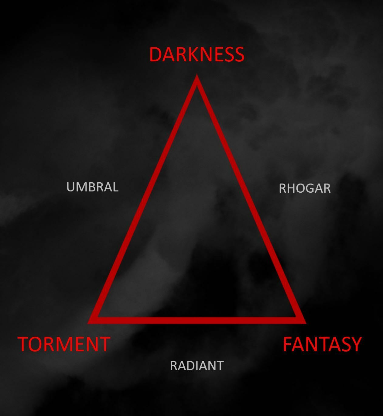
I also articulated the idea of a “thematic triangle” where each of the corners represented a strong pillar of the game’s art direction: torment, darkness and fantasy. The three main drivers (and gods) of the game are placed on each edge of this triangle, combining at least two pillars.
In Lords of the Fallen, the Radiants represent torment/fantasy, the Rhogars are darkness/fantasy and the Umbral stands for darkness/torment. This triangle became a tool for me to evaluate each artistic creation for the game: if it fell within the triangle, then I knew the asset was on the right track. Refining those pillars with more precise systems constituted the biggest task of the preproduction phase; it was about discovering the visual language needed to enable those pillars to shine, and the references to rely on.
For example, the Umbral realm was strongly influenced by the twisted artists Giger and Beksinski, but it became fully realised after injecting some imagery from the performer Olivier de Sagazan. Such references are a strong point to start with, but the more you create art for the game the more those developed concepts become central for your universe – right up to the point where you don’t have to search for references anymore.
Here is an example of one of the sub-themes and how it was realised in the game’s art direction: we wanted a strong ambiguity between religion and fanaticism, especially along the Holy Sentinels of Orius. To represent this madness visually, we focused on blood and thorns, but also accumulation. So instead of having a pair of candles on an altar, we covered it with wax and had the candles grow like roots on each corner of the church. We even covered the shoulders of our characters in wax!
This idea came to me when I remembered visiting a small chapel in France as a kid. There was an alcove where prayers could be made by lighting a candle under an old mural. It seemed nobody was actually taking off the consumed candles there; people were just piling up candle after candle on a mountain of melted wax. This intimate image flew from my memory directly into some of the locations in Lords of the Fallen.
How did you breathe life into Mournstead with your team?
If the art director is a fair participant in the overall direction of the project, then it goes without saying that they’re NOTHING without a great team around them. The key word of this collaboration is “trust”, and I believe that goes both ways. The art director is just a compass, setting a long term direction for the ship to sail, and more or less checking the map from time to time. The crew – each of the individual artists and team members – are the true heroes guiding the ship forward.
It was clear early on that there would be a lot of things that I’d have to delegate. In a project of this size the collaboration and validation between directors, leads and colleagues is primordial, especially in a fully remote company like HEXWORKS. Pragmatically, this trust goes both ways: Each design or new concept goes past my eyes, but likewise, any good idea or proposal from a collaborator can be taken and developed further if it fits with the art direction. I strongly think I’ve my own artistic affinities and flaws: for example, I’m a better character designer than architectural artist, and therefore I have to rely on our environment and lighting artists to achieve our goals. I can’t stress enough how much the collaboration with our director of photography, Erwan Fagard, was both supportive and enriching to me.
All this is to say that my day-to-day work during preproduction and production was mainly doing paint-overs and sketches, annotations, and briefs. Those briefs are actually one of the most important parts of the job, because you’re setting the vision for the artists in a few chosen words, references and sketches. They’re moments where I would take the decisions of Saul Gascon (executive producer and head of studio) and Cezar Virtosu (creative director) and translate them into a visual language for the rest of the art team. I usually write those briefs alone, they’re like a secret pact between me and the artist. That way, I can combine the mandatory elements of storytelling and gameplay, and at the same time make sure the overall direction is focused towards the emotion or resonance I want to achieve.
This is how we respect a delicate balance between gameplay, story, and art… yes, yet again a new magic triangle!
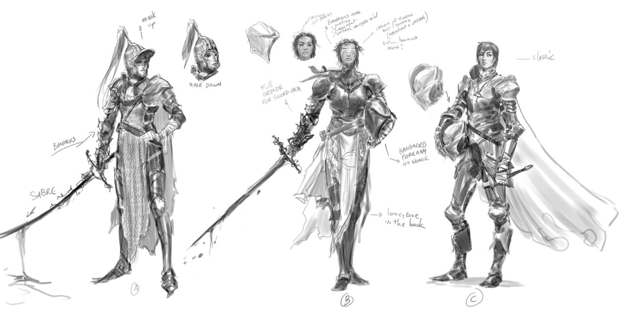
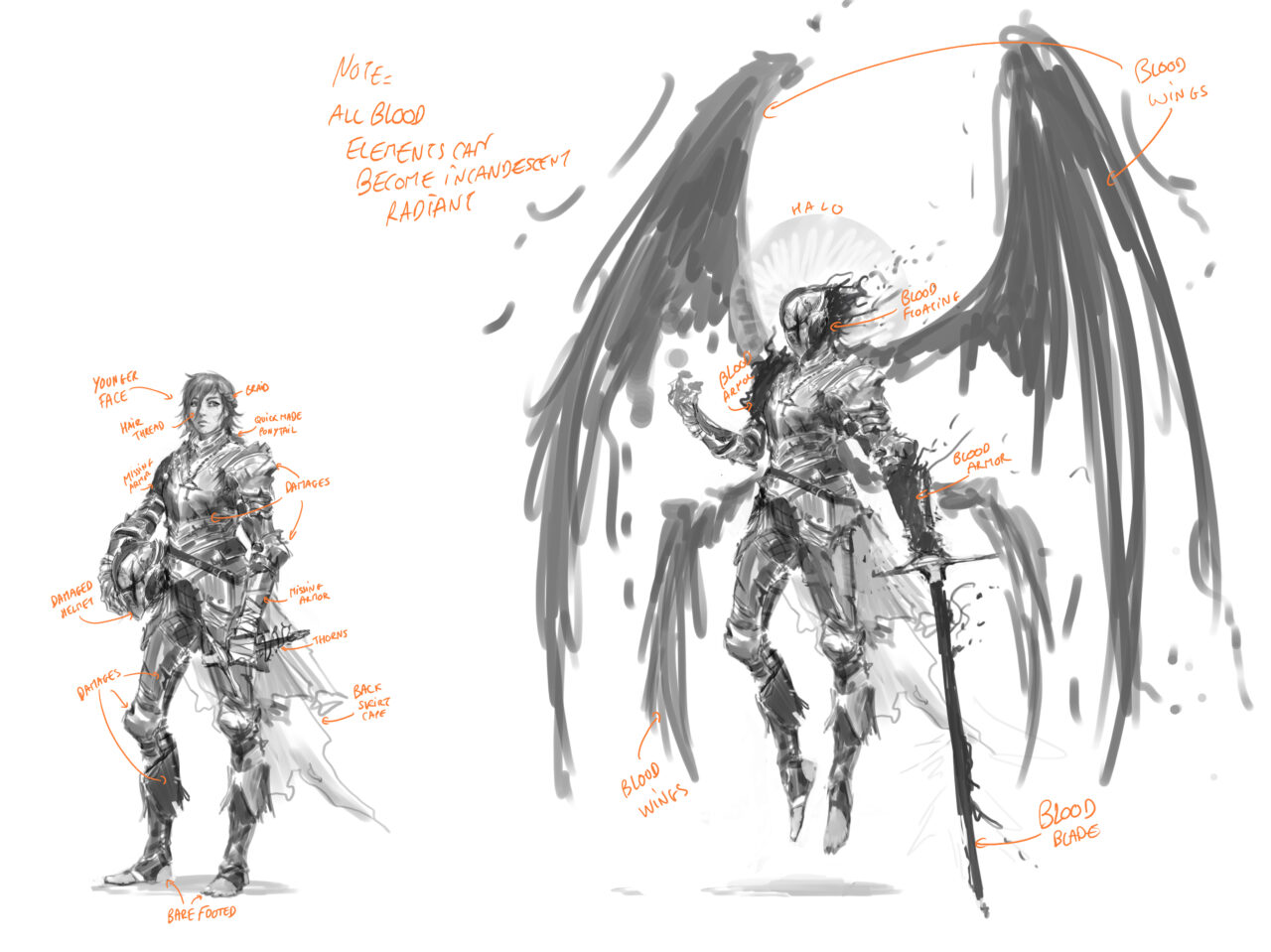
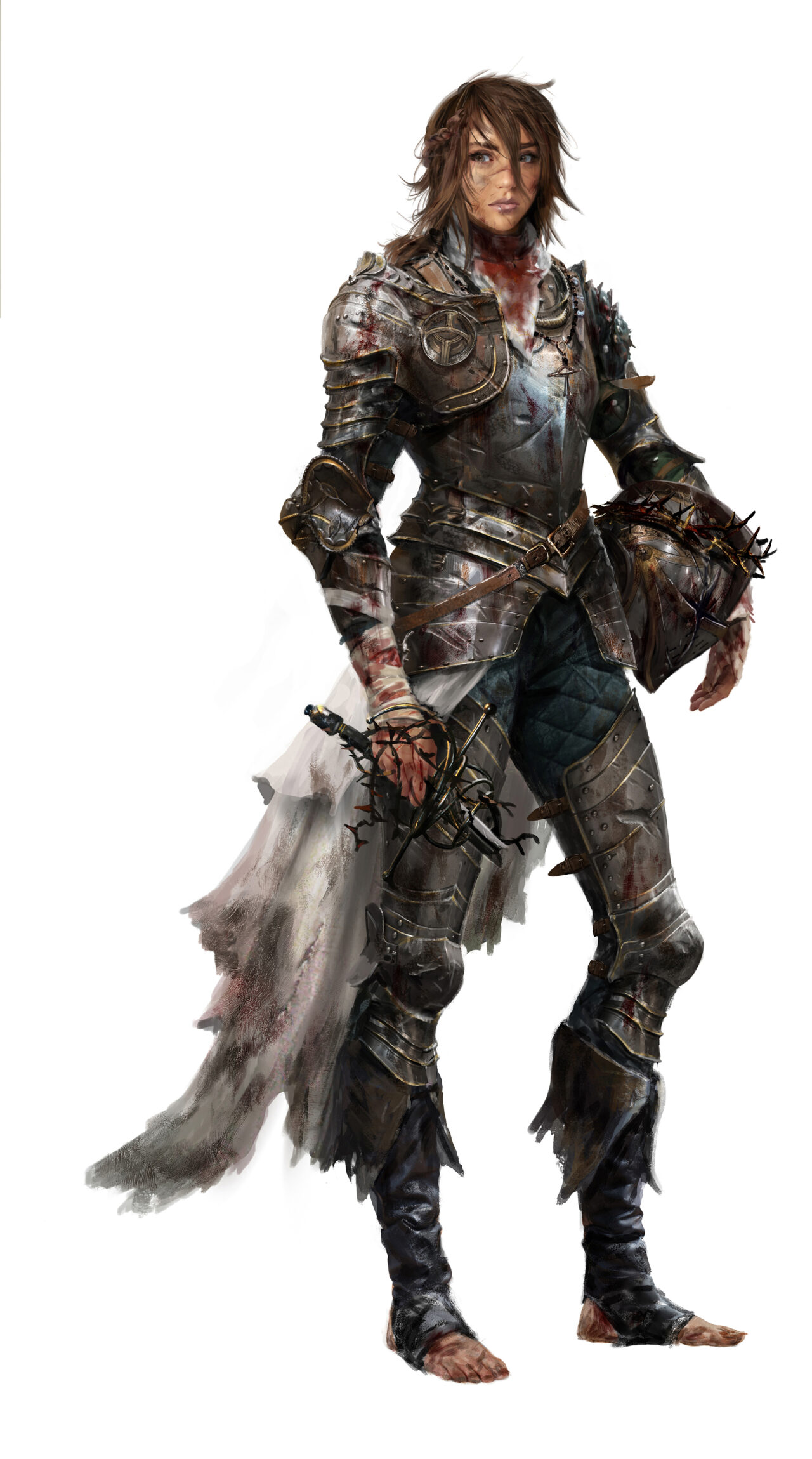
Concept Art : Fred Rambaud
It is also important to mention that I was strongly supported by Javier Lajara, our art manager. His role of directly managing the artists and art production meant I could fully focus on creativity and reviewing. I was very lucky to have such a liberty of action and to be able to put my brain to its best use: finding creative solutions that would push the project forward.
In terms of painting and design, I have a personal mantra: “Mood goes over structure”. This means I always favour a concept that brings me emotion rather than perfect detail accuracy. Composition, storytelling, silhouettes and mood are my best tools to articulate art direction. Of course, it can be pushed into the smallest tiny details (“Please add a skull here… add a bit of rust on this gauntlet”) but I was always confident in our art team, that they were the experts to get into the deepest details of our assets.
Again, they are the true heroes of this journey!
In Light, We Walk.





 Buy Now

